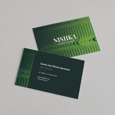
Flyers are a preferred advertising material for businesses because they deliver their message quickly, directly, and are handed out personally to recipients. They are economical in format and at the same time effective, easy to distribute, and engaging with their short and clear content.
Before jumping into the actual flyer design idea, you need to determine what role the flyer will play. The objectives may vary: a promotional campaign, a key brand event, showcasing new products, or promoting the company’s activities.
Depending on the nature of your strategy, align the format and message accordingly.
Pay attention to the design – it should support the concept, include action-driven language, and provide quality information to motivate and guide the audience in your desired direction.
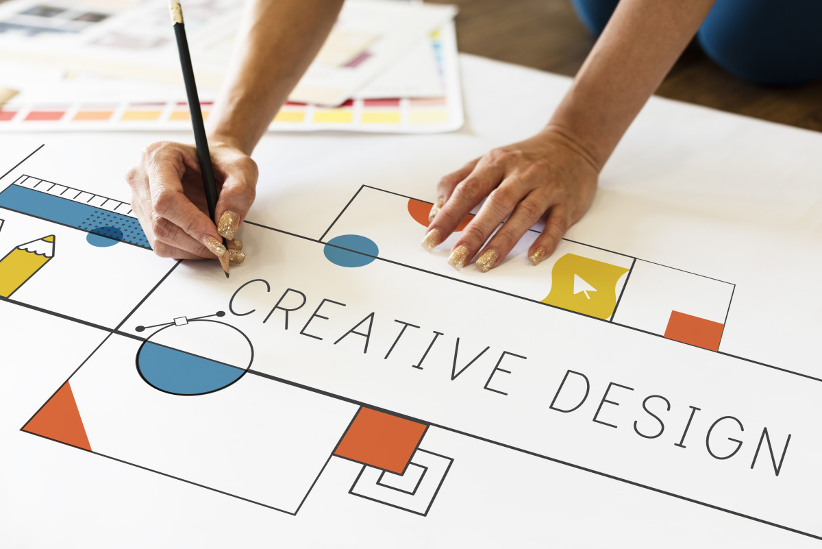
Flyer design ideas that really work and stand the test of time:
✅ Clean structure 🧩
The practical function of flyers lies in their brief and clear content – they have a maximally simplified structure, aiming for specific actions.
Do you want them to visit your website, buy a product, attend your event? This is where the flyer comes in and directly targets those goals.
✅ QR code 🔗📱
The QR code has become an almost mandatory element in modern flyer design. It typically links to a website or current offer, but you can add additional features as long as they align with your goals.
✅ Infographics 📊🧠
If you have numbers, processes, or comparisons – an infographic can present them clearly and understandably.
Visual elements like icons, diagrams, and charts immediately catch the eye and help retain attention.
➡️ Example: “How our service works – in 3 steps” can be visualized using icons and arrows instead of a lengthy text.
Instead of text blocks, visual summaries allow for quick comprehension of the core message – especially useful for services, promotions, or events.
✅ The impact of color 🎨🌈
Flyer design trends often follow clear color preferences that combine modern aesthetics with communication effectiveness.
🌿 Nature-inspired colors – perfect for eco products, cosmetics, social causes.
⚡ Neon highlights – ideal for youth events, nightlife, tech.
⚫ Neutral shades & monochrome – signal luxury, minimalism, and professionalism.
🎯 Tip: Follow Pantone's Color of the Year to stay on trend.
✅ Impressive trends 🔥✨
If you have your own style – good. But don’t ignore current trends entirely. That can backfire.
🧠 Combine minimalism with dramatic touches: more white space, bold fonts, strong contrast, clear layout.
🎯 Focus on the message. Avoid clutter.
✅ Fonts that transform 🔠🔤
Each font creates a distinct mood and can completely change the feel of your flyer.
🎨 Use artistic display fonts for headings.
💡 Sometimes all it takes is one great font to elevate the whole design.
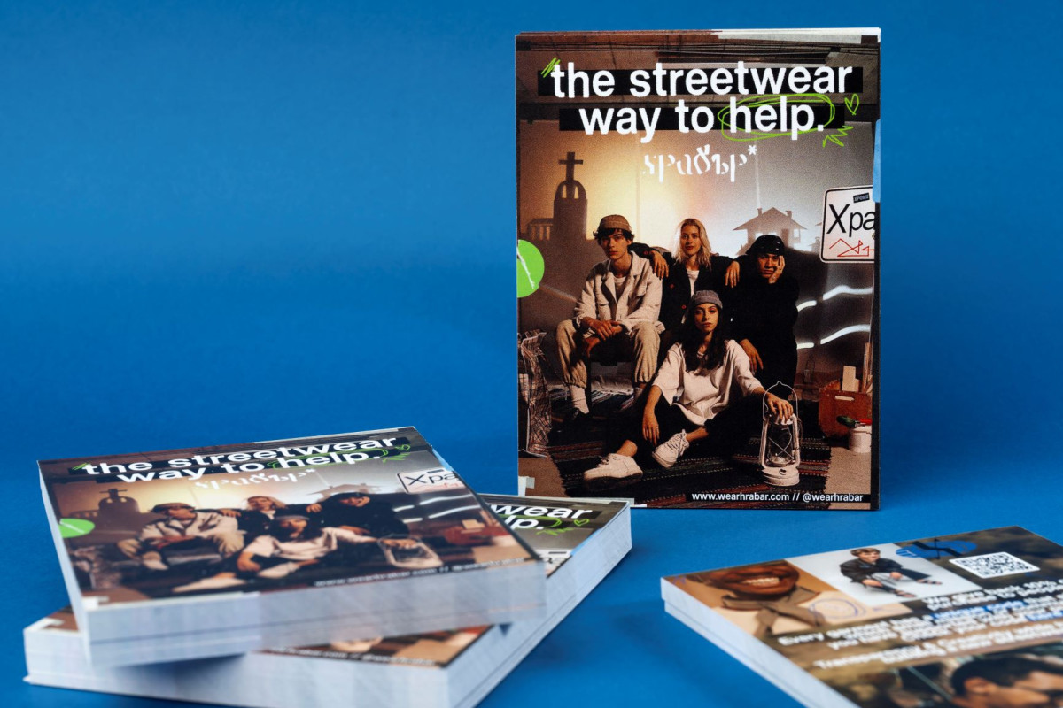
✅ Key visual 📸🎯
This is the visual centerpiece that draws attention.
In seconds, it can attract—or repel—the viewer.
Choose wisely. Don’t just pick the first impressive photo you see. Think strategically.
✅ Focus on the essentials 🔍📌
From the key visual, attention flows to everything else.
Details matter.
✔️ Make sure surrounding elements support your central image
✔️ Show only what’s truly valuable to your audience
✅ Engage all the senses ✋👀
Caught their eye? Delivered key info? Good. But don’t stop there.
Use tactile printing effects:
🔹 Matte lamination
🔹 Metallic foil
🔹 Velvet soft-touch coating
These elevate the physical feel and leave a lasting impression.
✅ Asymmetry & bold layouts 🌀🚀
Don’t be afraid to go bold and break the grid.
Some industries benefit from creative chaos.
📸 Try off-center visuals
🔀 Use asymmetrical compositions
🎨 Let your brand personality shine
It could be your winning formula.